 There is a system in every artwork.
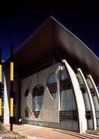
What I like of the image beside is the facade contains a sense of depth. I would like to use the simple, straightforward roofline of the market to unify everything underneath. The layer before entering into the market shall be another interesting feature second to the massing/form of the whole market building. The louvers shall be the shading device, another layer of advertising canvas or other half translucent material shall be added in front of the louvers to shade off more lights. The advertising material shall sometimes be solid panel treated as vertical shading device, creating a contrast with the horizontal louvers. In a Disney showcase, you can find the main actors/characters, might as well you can find some other little characters that make the movie looks more interesting. It is the same with architectural work; sometimes 'parts' are needed to the architectural building rather than just showing box/building form. The intension is to make the work alive. It is a system. Another thing is separation of elements to emphases the element itself.
image from http://www.jcy.net/jcy_flash4.htm by Jones Coulter Young from Australia.
No comments:
Post a Comment